The Einstein & BOINC forums make-over discussion
Message boards :
The Lounge :
The Einstein & BOINC forums make-over discussion
Message board moderation
Previous · 1 . . . 3 · 4 · 5 · 6 · 7 · 8 · 9 . . . 12 · Next
| Author | Message |
|---|---|
 Gary Charpentier Gary CharpentierSend message Joined: 23 Feb 08 Posts: 2464 
|
Drupal is defiantly not a good answer. It isn't Drupal that is the issue at Einstein, it is who is coding the website. I've seen a couple super good forums run on Drupal. It just requires work from the sys admin to set it up to be professional. 
ID: 74209 · |
|
Send message Joined: 25 Nov 05 Posts: 1654 
|
The links here on the bottom line to Choose a Project, and Download BOINC has disappeared. ID: 74222 · |
Jord Send message Joined: 29 Aug 05 Posts: 15480 
|
They were never there, afaik. There was a link to the main site and to Your Account there, but those have been moved to the navbar that's always on top. ID: 74223 · |
|
Send message Joined: 1 Oct 15 Posts: 391
|
... the navbar that's always on top. Which now, thankfully, seems to no longer always be on top, but scrolls away as it should. 
ID: 74224 · |
|
Jord Send message Joined: 29 Aug 05 Posts: 15480
|
Not so sure it should scroll away. That's something I asked. I kinda liked it always on top. ID: 74225 · |
|
Send message Joined: 1 Oct 15 Posts: 391
|
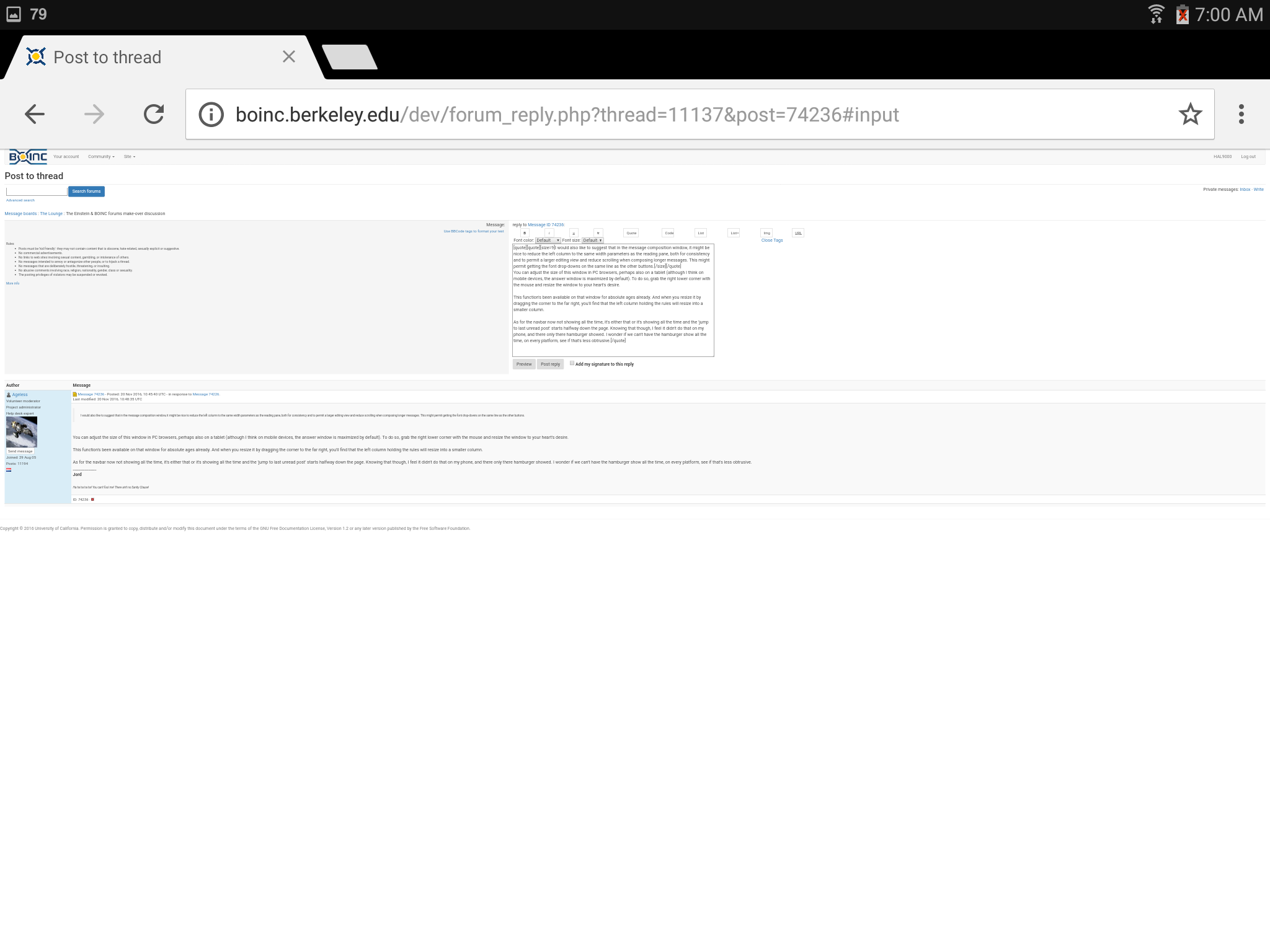
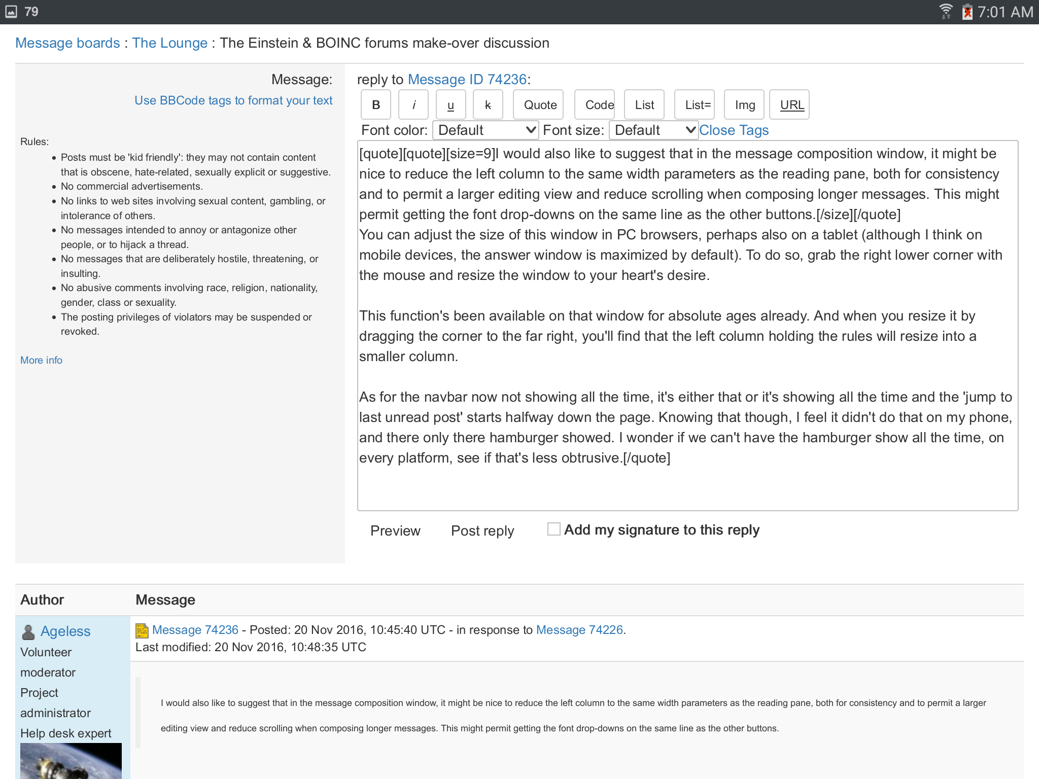
Not so sure it should scroll away. That's something I asked. I kinda liked it always on top. If it doesn't scroll off then vertical alignments need to be adjusted for it, as that's why they were off. Problem with this is that by the time you have a browser, want its tool bars and book marks and tabs visible, perhaps need to keep it down a bit from the top due to other windows you wish to tile, then the site uses a few lines for its top bar, you start getting to the point where there's little left for actual content and it becomes annoying. No "one size fits all" in a windowing environment, for sure. I would also like to suggest that in the message composition window, it might be nice to reduce the left column to the same width parameters as the reading pane, both for consistency and to permit a larger editing view and reduce scrolling when composing longer messages. This might permit getting the font drop-downs on the same line as the other buttons.
ID: 74226 · |
|
Send message Joined: 25 Nov 05 Posts: 1654
|
OK, me not being clear again. Happens a lot these days. :( This is the page that I had in mind: Open-source software for volunteer computing When I needed it, I'd use a link to the index page for here, scroll to the bottom, and then click the link there. I found it using Google, and it's now separately bookmarked, so not a problem. I've never considered the large logo as a hot link, so I didn't try that. ID: 74227 · |
|
Jord Send message Joined: 29 Aug 05 Posts: 15480
|
I would also like to suggest that in the message composition window, it might be nice to reduce the left column to the same width parameters as the reading pane, both for consistency and to permit a larger editing view and reduce scrolling when composing longer messages. This might permit getting the font drop-downs on the same line as the other buttons. You can adjust the size of this window in PC browsers, perhaps also on a tablet (although I think on mobile devices, the answer window is maximized by default). To do so, grab the right lower corner with the mouse and resize the window to your heart's desire. This function's been available on that window for absolute ages already. And when you resize it by dragging the corner to the far right, you'll find that the left column holding the rules will resize into a smaller column. As for the navbar now not showing all the time, it's either that or it's showing all the time and the 'jump to last unread post' starts halfway down the page. Knowing that though, I feel it didn't do that on my phone, and there only there hamburger showed. I wonder if we can't have the hamburger show all the time, on every platform, see if that's less obtrusive. ID: 74236 · |
|
Send message Joined: 1 Oct 15 Posts: 391
|
This function's been available on that window for absolute ages already. And when you resize it by dragging the corner to the far right, you'll find that the left column holding the rules will resize into a smaller column. Gee, Jord, thanks for the lesson on Windows 3.1. Guess I missed that, 30 years ago. Not. Suppose maybe I meant the relative size between the two columns? What a ridiculous comment.
ID: 74237 · |
|
Jord Send message Joined: 29 Aug 05 Posts: 15480
|
I found it using Google Editing the URL to just https://boinc.berkeley.edu/ was never in your thoughts? ;-) I've never considered the large logo as a hot link, so I didn't try that. Well... it's what was asked for in this thread - and separately already by me in the emails I fire to David. But yes, the BOINC logo is the link to the front page. It always was that on the forums. It's also that as far as I know everywhere else, even in the Wiki pages. ID: 74238 · |
|
Jord Send message Joined: 29 Aug 05 Posts: 15480
|
Suppose maybe I meant the relative size between the two columns? Yours as well, when you put it like that. Welcome to my ignore list. ID: 74239 · |
|
Send message Joined: 1 Oct 15 Posts: 391
|
Yours as well, when you put it like that. Welcome to my ignore list. Likewise. [edit] Pardon me for thinking that one was free to offer suggestions and comments without being ridiculed and insulted. I shall keep that in mind, in future ... [/edit]
ID: 74240 · |
|
Send message Joined: 13 Jun 14 Posts: 81
|
I would also like to suggest that in the message composition window, it might be nice to reduce the left column to the same width parameters as the reading pane, both for consistency and to permit a larger editing view and reduce scrolling when composing longer messages. This might permit getting the font drop-downs on the same line as the other buttons. I believe they are referring to the WIDTH the Rules box not so much the height. It has always IMO been rather oversized. As it takes up ~40% of the screen width and does provide a great deal of information. Personally I like being able to actually see as much of a message when I'm replying to it. So I'll pull the window off the screen to basically take up the full screen. http://www.hal6000.com/boinc_projects/boinc/boinc_fora/firefox_desktop_1920x1080_reply.png It is find of a pain having to do it each time after a preview, but it is that or vertical screen down 100 lines instead of a two dozen. Placing the information above the message reply area might be a better solution while things are being considered. That could allow the message reply box to be much wider by default in all situations. Here are some comparisons of how things looks for me: Notebook at 1366x768: http://www.hal6000.com/boinc_projects/boinc/boinc_fora/firefox_desktop_1366x768.png Desktop at 1920x1080: http://www.hal6000.com/boinc_projects/boinc/boinc_fora/firefox_desktop_1920x1080.png Galaxy Tab S2 8.0 2048×1536 with Chrome. The pages come up super small. http://www.hal6000.com/boinc_projects/boinc/boinc_fora/chrome_mobile_boinc_fora.png http://www.hal6000.com/boinc_projects/boinc/boinc_fora/chrome_mobile_reply.png Galaxy Tab S2 8.0 2048×1536 with Chrome. Other projects some up normal size. http://www.hal6000.com/boinc_projects/boinc/boinc_fora/chrome_mobile_goofy_fora.png Galaxy Tab S2 8.0 2048×1536 with Firefox. The pages come up normal size. http://www.hal6000.com/boinc_projects/boinc/boinc_fora/firefox_mobile_reply.png ID: 74248 · |
|
Send message Joined: 1 Oct 15 Posts: 391
|
Yeah, I believe I did say width :)
ID: 74250 · |
|
Agentb Send message Joined: 30 May 15 Posts: 265 
|
This is new. (a Firefox update today so i expect that might be related. v50.0 !) When posting a message, if you left or right click the text area the background colour changes to orange while the mouse button is depressed. This is a little annoying. Other areas - such as Advanced Search - highlight border area, which is good. I also noticed you can resize the text area, which is good. I notice the button white out i mentioned before has been fixed. ID: 74252 · |
|
Jord Send message Joined: 29 Aug 05 Posts: 15480
|
I believe they are referring to the WIDTH the Rules box not so much the height. It has always IMO been rather oversized. As it takes up ~40% of the screen width and does provide a great deal of information. Personally I like being able to actually see as much of a message when I'm replying to it. So I'll pull the window off the screen to basically take up the full screen. And ever so personally, I copy the whole thing into Notepad++ on my second monitor and type away at an answer there. Added advantages here are that when I do copy the message to an answer window and the forums are down, I still have my message, plus I can look at the message and work on it for absolute ages, and rework it or throw it away if I feel it isn't going to be what I wanted it to be. ID: 74255 · |
|
Jord Send message Joined: 29 Aug 05 Posts: 15480
|
What I am not for is for someone who can't be bothered to explain what he means in the first place, to post a rage quit obnoxious barf ball onto the forums. Doing so will land you on my ignore list. If you then want to return the favor, please be my guest, it's not as if I am peeking under "click here" to see what you were saying anyway. I'll leave that thankless job up to my fellow moderators, and otherwise to your fellow posters to see what you think you can get away with. So I have come to a decision: up till this moment I was doing people a favor to forward their views, thoughts and advice to the developers of these forums, but I quit that as I don't need the additional crap from that rather thankless job. You want to be heard or personally ignored, want to make that change worth something, go register to the BOINC Development email list and send your stuff in to there. Or email David directly. Mind that he'll ignore you as well when he finds your posting style to be less than friendly and attentive. And rightly so. Getting registered and your advice/views onto that list doesn't mean you'll always be entitled to an answer. Edit: When you do email the list and you want to add one or more images to explain what you see, make sure to store the images on an external site. Imgur, Photobucket, Imageshack, doesn't matter. The email list will strip any images you add and so no one will be able to see them. ID: 74256 · |
|
Send message Joined: 13 Jun 14 Posts: 81
|
I believe they are referring to the WIDTH the Rules box not so much the height. It has always IMO been rather oversized. As it takes up ~40% of the screen width and does provide a great deal of information. Personally I like being able to actually see as much of a message when I'm replying to it. So I'll pull the window off the screen to basically take up the full screen. I had not considered dropping everything into an external editor. So far I guess I've been lucky. When a fora goes down as I'm posting I hit back and can retrieve what I had written until it comes back up again. I figure tossing in my input can't hurt. Sometimes how people actually use things doesn't line up with how the design was meant to be used & small tweaks can streamline things for everyone. ID: 74258 · |
|
Gary Charpentier Send message Joined: 23 Feb 08 Posts: 2464
|
Rolled out at Seti Beta https://setiweb.ssl.berkeley.edu/beta/forum_thread.php?id=2348&postid=60166 Tutankhamon wrote: If it's going to be like this in the future, count me out of this ugly looking, and unusable msg board. Epic Fail if that is the description your customers use for your creation.
ID: 74264 · |
|
Jord Send message Joined: 29 Aug 05 Posts: 15480
|
The 'zoom' is easily fixed. That's something that's 'stuck' in the Chrome preferences, so press hamburger, Settings, Accessibility, set 'text scaling' to something higher than the default 107% and that's it. One can zoom in to their heart's content. Here's my Chrome with text scaling to 125%:   ID: 74265 · |
Copyright © 2024 University of California.
Permission is granted to copy, distribute and/or modify this document
under the terms of the GNU Free Documentation License,
Version 1.2 or any later version published by the Free Software Foundation.